worldwide music scene map
Reconstructing the structure of the world-wide music scene with Last.fm
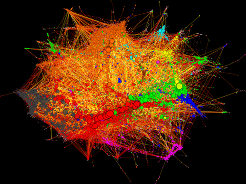
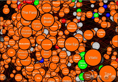
“Basically: this is a graph representation of the similarity relationships derived from the database of Last.fm. The circles (vertices) on the left hand side figure are bands, musicians, composers, whatever you will find in the Music section of the site. Lines (edges) connect similar artists. In order not to make the whole thing an ugly hairball, only a subset of all existing connections are displayed. Last.fm quantifies artist similarities in a scale of 100 points – I dropped connections below 80, mostly because the degree distribution follows a nice power law at this cutoff level. Edges are colored according to their centrality in the network, from white to dark gray in a nice logarithmical gradient (the visualisation with black background use a different palette from black through red and yellow to white). Insignificant edges are more transparent than significant ones. Vertex sizes vary according to the popularity of the artists.Vertex colors correspond to musical genres, identified by tags attached to the artists by the users of Last.fm. Rock is red, metal is dark grey, electronic is orange, hip-hop and rap is blue, jazz is yellow, reggae and ska is magenta, classical music is cyan, country, folk and world music is brown, pop is green. Light grey vertices are unclassified.”
de surfat live prin graph aici
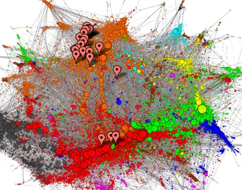
iar daca aveti cont de last.fm, aici va puteti face o pozitionare personala in lumea muzicii. eu ma situez cam asa.
Posted in academia, de-dans on December 19th, 2008 by de-dans | 0 Comments

 gmail
gmail com
com